Chipit

Chipit
UX/UI Design | Illustration
Chipit was created as a fun and engaging product to promote an eco-friendly lifestyle. The project features a line of reusable bags with a built-in chip. When scanned at a grocery store with their purchases, customers are able to collect points and use them in a mobile game.
This project is fictional and was created for my senior project at George Brown College. Recently, I decided to redesign the project to incorporate my learnings from Centennial College.
Role:
UX/UI Designer
Graphic Designer

conception
Advancements in food processing and packaging have allowed nationwide access to foods, allowing them to withstand long travel distances to your grocery store. However, these advancements result in more waste being dumped in our landfills, causing harm to the environment.
While food packaging may not become obsolete any time soon, there needs to be a larger effort to mitigate the amount of waste going to our environment. My goal was to explore unique ways to promote eco-friendly habits that stick with people.
design process

research
To better understand the current market and user behaviours, a multi-methodology research approach was taken.
online articles
With a large number of substrates and methods used for food packaging, online articles were used to narrow down the most harmful material. This helped to provide a focal point to the thesis.
According to initial research, plastic had the lowest recycling rate when compared to other substrates.

user observation
With the advancements in food preparations and lifestyle changes, the need for fast and convenient is apparent. The initial focus for plastic food packaging was not looking too bright, as plastic packaging helps preserve foods longer, allowing shoppers to store foods for longer.
While observing shoppers checkout, it became apparent that the majority of shoppers choose to bring groceries home in plastic bags. When asked, customers admitted to re-using plastic bags once before they end up in the garbage.
In addition to shopping behaviours, user lifestyles were observed as well. Technology appeared to be a central focus in everyday life, and many rely on devices for convenience.
competitive analysis
With the focus now shifted onto plastic bags, research was conducted on current programs that made efforts to reduce plastic bag usage. The conclusion as that current programs limit users (points are only earned via specific payment methods or stores) or have not stuck (plastic bag ban was lifted).
concept exploration
concept 1
Initially, the idea was for the program to work through a card.
Points are earned if users choose to bag groceries in reusable bags, and can be used towards rebates off groceries. Cashiers would simply have to swipe or scan the card when checking out, and the card would be linked to a mobile application.
During a design consultation, individuals noted that physical cards can become a hassle for users.

concept 2
The idea of installing a chip (similar to the ones used in credit cards) in reusable bags was explored to combat the concerns with the card.
While most had positive feedback towards the chip, there was a concern on the rebate. The primary feedback was the solution relied heavily on third-party companies and was not design-centric. This began the search for a more creative solution.

final concept
After further research a deliberation, the idea of creating a game came up. This would offer users an fun and interactive experiencing, while acting as an incentive to adopt the program.

gameplay concepts

concept 1
The first game concept involved unique characters users can raise.
Each bag was to contain a unique code that unlocks different characters. Points earned from the program can be used towards food and clothing to customize their characters. In addition, players can use social media to share their progress with friends.
Ultimately, this concept was scrapped as it did not provide a lot of room to keep players engaged.
final gameplay
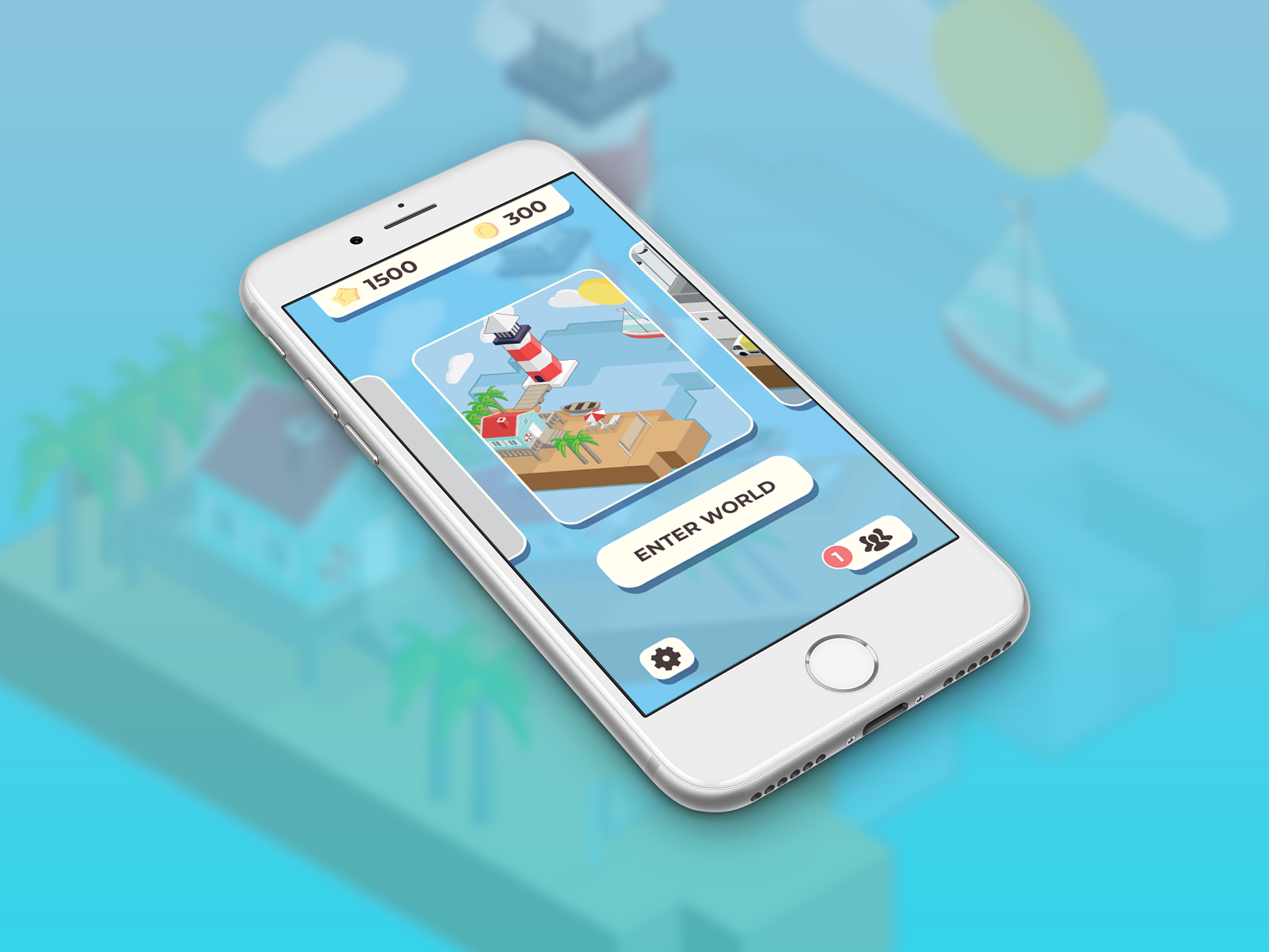
The final game concept centers around an expandable world. Each bag contains a unique code that allows users to unlock different worlds.
Worlds will start off extremely polluted, helping illustrate the negative impacts waste has on the environment. Points allow players to clean up and customize their land. In addition, players can interact with different elements (example, petting animals, watering plants).
This concept was ultimately chosen, as it provides opportunities to expand and helps illustrate the negative and positive effects on can have on the environment.
design
Concept Art

Upon reflection, I realized the that UI design did not do the project justice. The application and art was revisited to incorporate my UX/UI learnings from Centennial College.

Final art

UI Design

branding

Product Line
The following bags were created to accompany the application. Each bag contains a code that unlocks a world around their respective theme.


